fbpx

Outreach Monks

Content Marketing: What It Is and Why It Matters?

70% of companies are creating more content than ever, and only 21% of marketers are sure it’s working. That’s a huge effort/reward gap, and it’s usually because there’s no specific strategy driving the content.

This is where content marketing steps in. Done right, it aids you in planning, producing, and distributing content with intention, so what you publish matters to your business objectives.

In this guide, you will learn what content marketing is, how it works, what kind of content you can produce, and how to build an effective strategy.

What Is Content Marketing?

Content marketing is the process of creating and sharing useful content, like blogs, videos, or social posts, to attract and engage your target audience.

The concept is to give individuals informative information so that they will believe in your company and become customers.

Rather than showing ads, content marketing involves assisting first, so people come to you once they’re ready to buy.

Example of Content Marketing

loreal Content Marketing

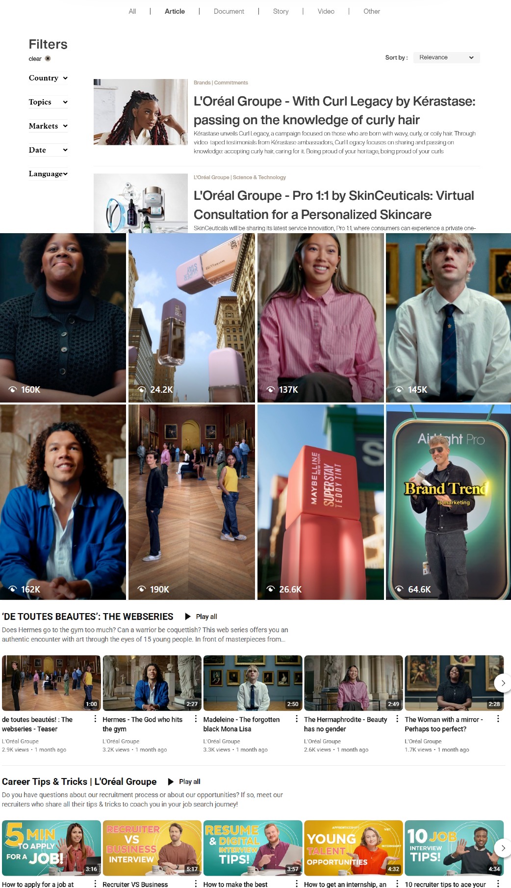
L’Oréal employs various forms of content such as articles, YouTube videos, Instagram posts, and product stories to engage with their audience.

This picture demonstrates how L’Oréal combines channels—such as Instagram, YouTube, and blog posts—to share valuable content. They share tips on beauty, company background, expert interviews, and product examples. This strategy assists them in building trust, remaining top of mind, and forming relationships with their target audience naturally.

That’s a great example of content marketing done right: consistent, valuable, and across different formats.

How Does Content Marketing Work?

Content marketing functions by assisting individuals through various stages prior to buying. It’s not selling directly—it’s providing the appropriate content at the appropriate moment.

Here’s how it takes individuals through the buyer journey:

1) Awareness Stage

In the awareness stage, people are just starting to understand they have a problem or need. They’re not looking to buy yet—they’re looking to learn.

Your job at this point is to educate, not sell.

What to share:

  • Blog posts that explain common problems
  • Social media tips and short videos
  • Infographics that break down ideas
  • “How-to” guides that solve basic issues

Example: If you sell skincare, you might post a blog like “5 Reasons Your Skin Feels Dry Every Morning.” It’s helpful, and it brings people in without pushing a product.

At this stage, the goal is to offer value and build trust. People who find your content helpful are more likely to come back later.

2) Consideration Stage

In the consideration stage, people already know what their problem is—and now they’re looking for ways to solve it. They’re comparing options, researching solutions, and thinking more seriously.

Your content here should help them understand why your product or service is a good fit.

What to share:

  • In-depth guides or tutorials
  • Product comparison posts
  • Case studies and real results
  • Explainer videos
  • Free tools or checklists

The goal here is to show value and position your solution as a smart choice—without being too salesy.

3) Decision Stage

In the decision stage, people are ready to take action. They’ve done their research, compared options, and now they just need a final reason to choose you.

This is the time to show proof, give reassurance, and make it easy to say “yes.”

What to share:

  • Customer testimonials and reviews
  • Product demos or trial offers
  • Special discounts or limited-time deals
  • FAQ pages to clear last-minute doubts
  • Success stories or user-generated content

The goal is to give them that final nudge with content that builds confidence and removes hesitation.

Types of Content You Can Create

Here are some popular content formats you can use in your content marketing strategy:

📝 Blog Posts & Articles: Great for SEO and answering common questions.

🎥 Videos & Tutorials: Engaging and easy to understand—perfect for demos or how-tos.

📊 Infographics: Quickly explain complex topics with visuals.

🎧 Podcasts: Share insights, interviews, and build a loyal audience.

🧾 Case Studies & Testimonials: Show real results to build trust.

📱 Social Media Content: Short, catchy posts to connect with your audience daily.

📬 Email Newsletters: Keep your audience updated and bring them back to your site.

📘 Ebooks & Guides: Offer deep insights or free value in exchange for emails or leads.

How to Build a Content Marketing Strategy (Step-by-Step)

Creating content without a plan is like driving without a map. Follow these simple steps to build a content marketing strategy that works:

1) Define your goals and audience

Before you create content out of nothing, it is key that you have a goal in mind and an audience identified. If you don’t do that at the start, your content may not see the results you are after.

Set a clear goal:

Ask yourself: Why am I creating content?

It could be to drive more traffic, get sign-ups, build trust, or spread brand awareness. Once you know your goal, you can plan the right type of content and measure success.

Know your audience:

Who will read or watch your content? Understand their age, job, interests, and problems. This helps you speak their language and stay relevant.

Tip: Create a simple buyer persona—give your ideal customer a name, job, and basic needs. This keeps your content focused and personal.

When your goals and audience are clear, your content will have purpose—and better chances of helping your business grow.

Step 2: Choose Your Main Content Formats

Once you have your goals and audience in mind, it’s time to determine what kind of content you will create.

Earlier, we talked about the different types of content you can create. Here, the focus is on picking the right ones for your brand and your audience.

Think about your audience’s preferences and how they like to get information.

  • Do they like reading long articles, or do they prefer quick videos?
  • What’s easiest for you to create and manage consistently?

You don’t have to do everything. Start with 1–2 formats that you can manage well and your audience will enjoy. As you grow, you can experiment and expand into other formats that make sense.

👉 Tip: Don’t forget to keep your resources in mind—time, team, and budget. Starting small and getting it right is often better than spreading yourself too thin.

Step 3: Do Keyword and Topic Research

After choosing your content formats, the next step is figuring out what to write or talk about. That’s where keyword and topic research helps.

You want to create content people are already searching for. If you skip this step, you might end up making content no one’s interested in.

Useful tools: Semrush, Google Search, Ubersuggest, Ahrefs, AnswerThePublic

What to look for (using Semrush):

  1. Type your topic into Semrush’s Keyword Magic Tool
  2. Check Search Volume to see how many people search for it
  3. Look at Keyword Difficulty (KD%)—go for easy to moderate scores
  4. Use the Questions filter to find keywords that start with “how,” “what,” or “why”
  5. Group related keywords together for better planning
  6. Use the Topic Research tool to get blog ideas, headlines, and related questions

💡 Tip: Always match keywords with intent—are people trying to learn, compare, or buy?

Good keyword research helps you create content that gets seen, clicked, and shared—without guessing.

Step 4: Create a Content Calendar

As you have your what to create lined up, it’s time to think through when you will publish it. A content calendar is a great tool to use for organization, consistenc,y and focus. It helps you not to miss a post, enables you to stay ahead of the game instead of at the last minute, also you can use it to plan content around events, seasons, or product launches.

What to include in your calendar:

  • Topic/title of the content
  • Format (blog, video, social post, etc.)
  • Target keyword
  • Assigned writer or creator (if any)
  • Deadline and publish date
  • Promotion plan (where/how you’ll share it)

You can keep your calendar simple—use a Google Sheet, Trello, or tools like Notion. The goal is to stay on track without getting overwhelmed.

Step 5: Write, Optimize, and Publish

At this point it’s time to put your ideas into action by creating content which will in turn support your audience and your goals.

Write valuable content: Focus on creating useful content. For blogs, video scripts, or social posts that may be what you put out there  try to answer a question, solve a issue, or share something of value.

Keep it friendly and direct. Use short sentences, headings, and bullet points for ease of read.

Optimize for SEO (if it’s a blog or webpage):

  • Use your main keyword naturally in the title, first paragraph, and headings
  • Add relevant internal links to other useful pages or blogs
  • Use alt text on images so search engines can understand them
  • Make sure your meta title and description are clear and encourage clicks
  • Check that your content loads fast and looks good on both mobile and desktop

Publish your content: Once everything looks good, post it on your website or platform. Double-check formatting, images, and mobile layout before going live.

Great content is not just well-written—it’s structured, helpful, and easy to find.

Step 6: Promote Your Content

Just publishing content isn’t enough—you need to promote it so people actually see it.

Why promotion matters?

Even the best content won’t get noticed if no one knows it exists. Promotion helps you reach the right people and get better results from your efforts.

Ways to promote your content:

  • Share on social media: Post your content on platforms like LinkedIn, Instagram, X (Twitter), or Facebook—wherever your audience hangs out.
  • Email newsletters: Send your content to your email list with a short, catchy message.
  • Engage in communities: Share your content in forums, Facebook groups, or LinkedIn communities (only where it’s relevant).
  • Repurpose it: Turn a blog post into a short video, quote graphic, or carousel and share it in different formats.
  • Use paid ads (if needed): Boost important content with ads to reach more people, especially during launches.

Promoting your content gives it more reach, more views, and a better chance of bringing results.

Step 7: Track Results and Improve

Once your content is live and promoted, it’s important to see how it’s doing. Tracking performance helps you understand what works and what needs fixing.

What to track:

  • Pageviews – How many people saw your content
  • Time on page – Are people reading it or leaving quickly?
  • Click-through rate (CTR) – Are they clicking your links or CTAs?
  • Leads or sales – Did the content help reach your goal?
  • Shares and comments – Is your content engaging?

Tools you can use:

  • Google Analytics – For traffic and behavior
  • Search Console – For search performance
  • Social media insights – To track engagement
  • Tools like HubSpot or Semrush – For deeper content reports

What to improve: If something isn’t working, change it. Update old content, improve headlines, add better visuals, or try a new format.

Content marketing is not “set it and forget it.” The more you learn and improve, the better your results will get over time.

Best Content Marketing Tools

Here are some of the most useful tools to help you plan, create, and improve your content marketing.

1. SEO Tools

If you want your content to show up on search engines, you need smart SEO tools.

  • Semrush helps out in identifying the best keywords, we also use it to track our rankings and also see what our competitors are up to.
  • Ahrefs does great at backlink analysis and also in finding out keyword gaps.
  • Ubersuggest provides keyword ideas, traffic data, and also basic SEO advice.

2. Writing and Editing Tools

Good content is that which is easy to read and free of errors.

  • Grammarly checks out your spelling, grammar, and also tone which in turn makes your writing professional.
  • Hemingway Editor points out long and difficult sentences which in turn helps you to improve your writing.

3. Design Tools

Eye-catching visuals can make your content more engaging and shareable.

  • Canva is easy to use, even if you’re not a designer. You can create blog graphics, social media posts, infographics, and more.
  • Visme is great for making data visuals, reports, and presentations that look clean and professional.

4. Content Management Tools

You need a simple way to organize and publish your content.

  • WordPress is the most popular platform for blogs and websites. It’s flexible and easy to use.
  • Notion helps you plan and organize your content. You can keep track of ideas, build calendars, and work with your team.

5. Analytics Tools

To know what’s working, you need to track your results.

  • Google Analytics shows how people use your site—what they read, how long they stay, and where they come from.
  • HubSpot is a more advanced option that tracks content performance and helps manage leads and emails.

Conclusion

Content creation is not the focus of content marketing; it is about putting out the right content for your target audience. When done with intent, it will bring in consistent traffic, build trust, and see your business grow over time.

As a beginner or an advanced player, improve your results by setting clear goals, creating useful content, and staying consistent. With the right tools and plan, success will follow.

Speak to your audience, solve real problems, and let your content do the conversion.

FAQs About Content Marketing

How Do I Know What Topics My Audience Actually Cares About?

You can use tools like Google Trends, Semrush’s Topic Research, Reddit, or Quora to see what people are talking about in your industry. Also, check your competitors’ top-performing blog posts for clues.

What’s The Difference Between Content Marketing And Traditional Advertising?

Traditional ads interrupt people (like TV or pop-ups), while content marketing aims to help, educate, or entertain them. Content earns attention over time instead of paying for it upfront.

Can Small Businesses Do Content Marketing Without A Big Team?

Yes. Start small with 1–2 formats (like a weekly blog or Instagram post), and stay consistent. Use simple tools like Canva for visuals, Grammarly for writing, and Google Docs for planning.

How Do I Keep Content Fresh If I’ve Been Posting For A Long Time?

Revisit older posts and update them with new stats, examples, or insights. You can also repurpose old content into new formats—like turning a blog post into a YouTube video or Instagram carousel.

How Long Should The Content Be To Perform Well?

It depends on the topic and format. For blog posts, 1000–2000 words usually perform well for SEO if the content is useful and well-structured. But short-form content like social posts or videos can work too—if it delivers value quickly.

How Do I Repurpose Content Without Repeating Myself?

Break big content into smaller pieces or change the format. For example, turn a long article into a quick checklist, a short video, or a carousel post. Add a new angle or update it for a different audience segment.

What’s More Important—Quantity Or Quality?

Quality always wins. Posting fewer, high-value pieces will give better results than lots of rushed content. Start with a frequency you can maintain without lowering the standard.

Mobile-First Indexing: What It Is & 10 Best Practices to Stay Ahead

Mobile First Indexing

Ever wondered why your website isn’t ranking even though it looks great on desktop? Here’s the catch: Google now primarily uses the mobile version of your site to index and rank pages, not the desktop one.

In fact, over 63% of global website traffic now comes from mobile devices. That means if your site isn’t mobile-friendly, you’re likely losing both visibility and visitors.

In this guide, we’ll explain what mobile-first indexing really means, why it matters, and how you can optimize your site to stay ahead in search.

What is Mobile First Indexing?

Mobile-first indexing is Google’s way of prioritizing the mobile version of your website when it comes to indexing and ranking in search results. In the past, Google’s systems mainly looked at the desktop service of your site. But with more people browsing on phones, that approach no longer made sense.

Now, Google crawls the mobile version of your site first. If your mobile content isn’t as complete or optimized as your desktop version, you could see a drop in rankings.

So, having a responsive and consistent mobile site isn’t optional anymore. It’s essential for SEO.

How Does it Work?

Here’s how mobile-first indexing works:

  • Googlebot: Google uses a smartphone Googlebot to crawl your mobile site. It acts like a real user, navigating and evaluating everything from a mobile perspective.
  • Indexing: Whatever Googlebot sees on your mobile version is what gets indexed and ranked. If it’s not on mobile, it likely won’t count, simple as that.
  • Content: Google pays close attention to your mobile content, including text, images, videos, and even internal links. They all need to be present and accessible on mobile.
  • Metadata: It also checks your mobile site’s meta titles, descriptions, structured data, and other SEO tags to ensure they’re complete and match your desktop version.

📱 Mobile-First Indexing Timeline: A 7-Year Rollout

Yes, it really took over 6 years for Google to fully roll out mobile-first indexing! What began as a test in 2016 officially wrapped in May 2023. Here’s how it all unfolded:

  • April 2015 – Mobilegeddon hits: Mobile-friendliness becomes a ranking factor.
  • Nov 2016 – Google announces mobile-first indexing and starts testing.
  • Mar 2018 – Rollout begins across selected sites.
  • Dec 2018 – Over 50% of sites crawled via mobile-first.
  • July 2019 – All new sites are indexed mobile-first by default.
  • Mar 2020 – Over 70% adoption; 100% goal announced for Sept 2020.
  • July 2020 – COVID delays rollout to March 2021.
  • Mar 2021 – Tentative full adoption.
  • Feb 2023 – Some sites are still pending due to technical issues.
  • May 2023 – Final sites moved. Only technically limited sites remain desktop-crawled.
  • July 2024Warning: If your site isn’t accessible on mobile at all, it won’t be indexed anymore.

10 Best Practices for Mobile-First Indexing

Here are some best practices that will help ensure your site meets Google’s expectations and delivers a smooth experience across all devices.

Optimal Strategies for Mobile First Indexing

1. Prioritizing Responsive Design

A mobile-friendly site is essential. Responsive design ensures your website works well on every screen size and device.

Here’s why it matters:

  • Adapts to all devices: Whether on mobile, tablet, or desktop, your layout adjusts automatically.
  • Improves user experience: No more pinching or zooming. Content, images, and buttons fit the screen perfectly.
  • Google prefers it: A responsive website aligns with mobile-first indexing requirements, helping you rank better.
  • One site, less hassle: You don’t need a separate mobile site. Responsive design handles it all with one codebase.
  • Easier to maintain: Managing one site for all devices saves time and reduces errors.

Use CSS media queries, fluid grids, and flexible images to create a layout that’s as functional as it is beautiful, no matter what screen it’s viewed on.

2. Optimizing Site Speed

A slow site is a deal-breaker, especially on mobile. Users expect pages to load fast, and Google does too.

Here’s how fast loading benefits your site:

  • Better rankings: Page speed is a direct ranking factor for both desktop and Android devices search.
  • Lower bounce rates: Visitors won’t wait more than a few seconds. Speed keeps them engaged.
  • Improved user experience: Fast-loading pages keep your visitors happy and likely to convert.
  • Mobile data efficiency: Lighter, optimized pages use less data, perfect for mobile users on the go.
  • Higher conversions: Even a 1-second delay can drop conversions by 7% or more.

Use tools like Google PageSpeed Insights or Lighthouse to identify issues. Compress images, enable lazy loading, reduce JavaScript, and use caching to speed up your mobile experience.

3. Ensuring Content Parity

Content parity means your mobile and desktop sites should show the same core content. Google only looks at your mobile version for indexing now, so if something is missing on mobile, it doesn’t count.

Here’s what to focus on:

  • Match content: Ensure all headings, text, images, and videos available on desktop are also on mobile.
  • Structured data: Schema markup should be identical on both versions.
  • Meta tags: Titles and meta descriptions should be consistent to avoid SEO loss.
  • Internal links: Don’t hide important links on mobile. They’re still critical for crawling.

If your desktop page has more info, CTAs, or multimedia than mobile, that’s a red flag. Google will only rank what it can see on mobile, so treat that version as your main site.

4. Streamline Navigation

Your website’s navigation should be just as intuitive on mobile as it is on desktop. Poor navigation can make users bounce and confuse search engine bots.

  • Stick to a clean, collapsible mobile menu (like a hamburger menu) that keeps things tidy but accessible.
  • Avoid using hover effects, which don’t work well on mobile. Instead, rely on clear, clickable buttons.
  • Keep important pages within 1–2 taps from the homepage to minimize effort and friction for users.
  • Label your links clearly, and avoid cramming too many options into your menu.

A strong mobile navigation system ensures users and crawlers can find what they need without getting lost.

5. Prioritize Page Speed

Pagespeed insights to check mobile friendliness

Speed is one of the biggest ranking and usability factors for mobile-first indexing. A slow page frustrates users and increases bounce rates, especially on mobile.

  • Compress all images using tools like TinyPNG or Squoosh, and serve images in next-gen formats like WebP.
  • Minimize JavaScript and CSS files, and defer loading scripts that aren’t immediately needed.
  • Enable caching and use a Content Delivery Network (CDN) to speed up global performance.
  • Run regular tests with PageSpeed Insights and Core Web Vitals to catch new speed issues.

A page that loads in under 2.5 seconds gives your visitors a better experience and helps you stay competitive in search.

6. Use Responsive Design Over Separate URLs

Google has stated it prefers responsive websites because they make it easier to crawl and index content correctly.

  • Responsive design adapts the layout and elements based on the screen size, all using the same HTML and URL.
  • This means no need for mobile-specific URLs like “m.yoursite.com,” which can cause duplicate content and redirect issues.
  • It also simplifies technical SEO—there’s one version of your site to manage, optimize, and track in analytics.
  • If you must use separate mobile URLs, ensure that the correct rel=”alternate” and canonical tags are in place.

Switching to a responsive setup helps unify your site’s experience and makes things easier for users and search engines alike.

7. Ensure Mobile Content Matches Desktop

One of the most critical mobile-first indexing practices is content parity. Google only indexes what’s visible on your mobile site. If your mobile version lacks essential content from the desktop, that content may not rank.

  • Include the same headers, body text, and key visuals on both mobile and desktop.
  • Avoid collapsing or hiding content with expandable tabs or accordions unless necessary. If you must use them, ensure Googlebot can still crawl and render that content.
  • Match structured data, meta tags, and internal links across versions to preserve SEO value.

If your desktop page has a detailed section on pricing or features, make sure it’s available and visible on mobile too. Anything missing could cost you visibility and rankings in search results. Aim for a seamless experience that reflects the same value, no matter the screen size.

8. Use the Same Structured Data on Mobile and Desktop

Structured data helps search engines understand your content better and show rich results like FAQs, star ratings, and event details in the SERPs. With mobile-first indexing, Google relies solely on the structured data present on your mobile site. If your mobile version lacks important schema markup that exists on desktop, you’re missing out on valuable SEO benefits.

Here’s how to get it right:

  • Use the same structured data tags (like Product, Article, FAQ, HowTo, etc.) on both mobile and desktop versions.
  • Keep URLs, content hierarchy, and context consistent between versions.
  • Always validate your markup using Google’s Rich Results Test or the Schema Markup Validator to catch errors.
  • If using JSON-LD, ensure the script is included in the mobile HTML as well.

Structured data might not directly improve rankings, but it enhances click-through rates by adding visual richness to your listings. So, don’t leave it out on your mobile.

9. Avoid Lazy-Loading Primary Content on Mobile

Lazy-loading is a common technique used to speed up load times by deferring non-critical content, like images or videos, until users scroll down. While that’s great for performance, it can backfire if important content is lazy-loaded and not visible to Googlebot during its initial crawl.

Here’s what you should do:

  • Ensure that key content, like product descriptions, reviews, or article text, is fully rendered when the page loads.
  • If you use JavaScript-based lazy-loading, make sure the content is accessible to crawlers. Tools like Google’s URL Inspection Tool can help confirm this.
  • Don’t lazy-load anything that contributes to keyword targeting, structured data, or internal linking.
  • Use proper noscript tags as fallbacks for critical visuals, especially if they hold product information or CTAs.

If Google can’t see the content, it can’t rank it. So double-check that your primary mobile content loads instantly and is crawlable without extra user interaction.

10. Don’t Block Important Resources

Blocking critical resources like JavaScript, CSS, or image files in your robots.txt file can prevent Googlebot from fully understanding how your site works and looks, especially on mobile. If Google can’t access these files, it may not render your mobile pages properly, which can hurt your SEO.

Here’s what you should keep in mind:

  • Avoid disallowing directories such as /css/, /js/, or /images/ unless you have a very specific reason.
  • Use Google Search Console’s URL Inspection Tool to see how Googlebot is viewing your page.
  • Check your robots.txt file and update any outdated rules that may block essential assets.
  • If you’re using third-party scripts (like chatbots or analytics tools), ensure they’re hosted in accessible paths.

Google’s rendering engine needs full access to your resources to evaluate your mobile layout and user experience. Unintentionally blocking those resources could lead to poor indexing and ranking issues.

How Does Mobile-First Indexing Impact Your Website’s SEO?

If your mobile experience is poor, your entire site’s SEO performance can suffer. Here are the key areas it affects:

1. Mobile Content Becomes the Main Ranking Basis

Google no longer uses your desktop site as the primary source of content for indexing. If your mobile version lacks essential text, images, or a structured layout, your rankings could drop. This includes things like headings, embedded media, and internal links. Make sure your mobile pages reflect everything valuable on your desktop site.

2. Inconsistent User Experience Can Lower Rankings

A cluttered or confusing mobile layout can lead to users leaving quickly. High bounce rates and low time-on-site can signal to Google that your page isn’t useful. Navigation should be simple, buttons should be large enough, and fonts should be easy to read. The better the user experience, the stronger the ranking potential.

3. Structured Data and Meta Tags Must Match

Google reads structured data and metadata from your mobile site. If these are missing or different from the desktop version, your snippets might not display correctly. That can affect how your pages appear in search and reduce clicks. Always ensure meta titles, descriptions, and schema markup are present and consistent across versions.

4. Mobile Speed Matters More Than Ever

Google expects fast-loading mobile pages. If your mobile site takes too long to load, users will leave before engaging, and your rankings could suffer. Compress images, enable browser caching, and remove unnecessary scripts to boost speed. Tools like PageSpeed Insights can help you identify what needs fixing.

5. Impact on Crawl Budget and Indexing

Googlebot crawls the mobile version first, so it must be fully accessible. If certain resources like JavaScript, CSS, or images are blocked on mobile, your page might not render correctly. This can lead to incomplete indexing or lower rankings. Make sure important elements aren’t hidden or restricted in your mobile robots.txt file.

Conclusion

Mobile-first indexing isn’t just another Google update. It reflects how users engage with content today. If your website still prioritizes the desktop experience, you risk losing visibility, traffic, and leads. 

By optimizing your mobile version with responsive design, consistent content, and fast loading times, you stay aligned with Google’s priorities. Treat your mobile site as the primary version, not a secondary one. The better it performs, the better your overall SEO success will be, both now and in the future.

Frequently Asked Questions

What Happens if My Mobile Site Has Less Content Than Desktop?

Google will prioritize the mobile version for indexing. If key content is missing on mobile, it won’t be considered for rankings.

Do I Still Need a Desktop Version of My Website?

No, it’s not mandatory. But if you do have one, make sure it doesn’t differ significantly from your mobile version to avoid confusion.

Is Responsive Design Mandatory for Mobile-First Indexing?

It’s not required, but it's highly recommended. Responsive sites help ensure consistency between mobile and desktop versions.

Can Poor Mobile UX Affect My Rankings?

Yes, if users struggle to navigate or interact with your site on mobile, it can impact engagement signals that influence SEO.

Does Mobile-First Indexing Affect My Desktop Rankings?

Yes. Since Google uses the mobile version to index and rank, desktop rankings are also based on how your mobile site performs.

How Often Should I Audit My Mobile Site for SEO?

Ideally, every quarter. Check for changes in design, content updates, and technical issues like page speed and mobile usability.

Are Tablets Considered Mobile in Mobile-First Indexing?

Not exactly. Google treats tablets as a separate category, and indexing is focused primarily on smartphone views.

Do AMP Pages Influence Mobile-First Indexing?

AMP can improve load speed and user experience on mobile. But Google indexes your canonical mobile page, not the AMP version directly.